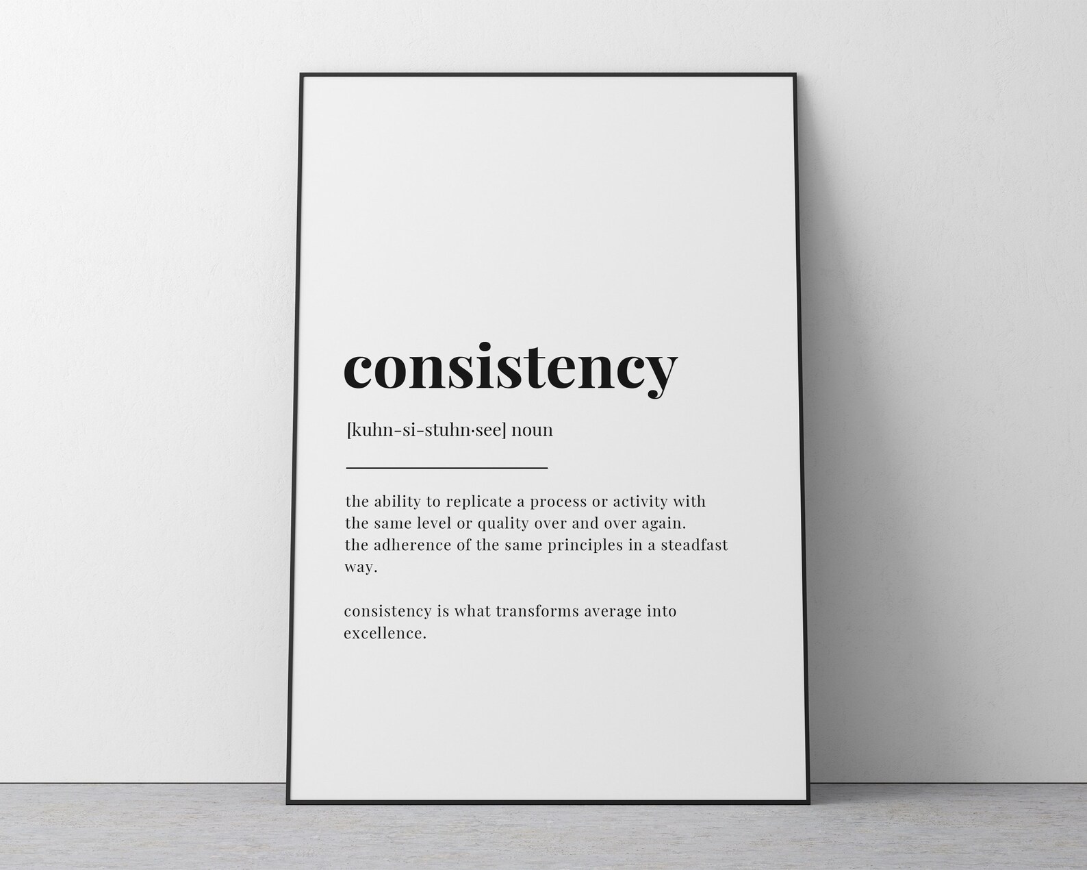
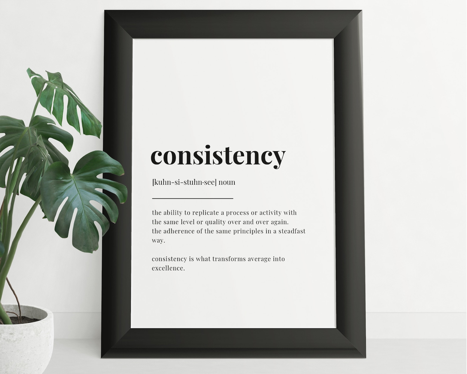
Consistency Definition Typography Poster Print
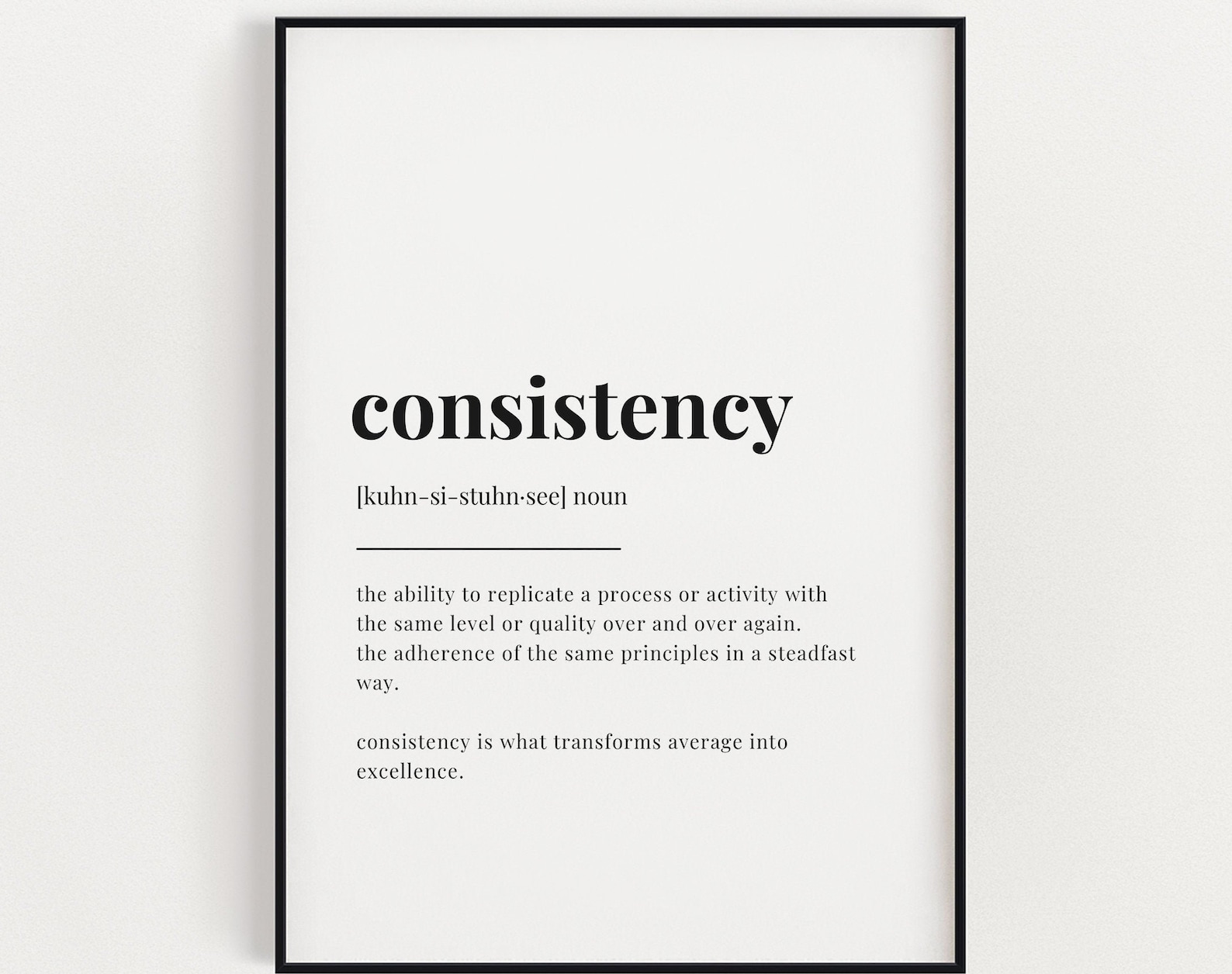
A typography print defining consistency in a clean, straightforward word-and-definition layout.
Description
Bold typography gives the word consistency center stage, followed by a clear definition print layout that keeps the look simple and direct. The humour comes from the familiar dictionary style, making the message feel smart, dry, and easy to read.
A home office, study, or hallway wall suits this kind of text-led decor, especially when paired with black frames and uncluttered styling. It also sits neatly in modern interiors, gallery walls, or spaces that lean into playful word art.
Buyers who enjoy witty typography or minimal statement pieces often choose this for desks, shelves, and shared rooms. It is also an easy choice for birthdays, new homes, or office spaces where a little definition-based humour lands well.
Materials & Sizes
Premium Matte Paper
- Finish: Matte, smooth, non-reflective.
- Weight: 200 gsm (80 lb), 0.26 mm thick.
- Paper: FSC-certified or equivalent.

Canvas
- Material: Cotton-polyester blend (300–350 gsm) on FSC-certified wood stretcher bars.
- Depth: Slim (2 cm) or thick (4 cm).
- Hanging kit: Included (varies by country).

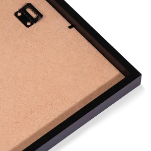
Wooden Framed Poster
- Frame: Pine wood in black, white, natural or dark brown; 20–25 mm deep, 10–14 mm wide.
- Paper: 170 gsm (65 lb) semi-gloss, FSC-certified or equivalent.
- Front: Shatterproof plexiglass.
- Ready to hang: Hanging kit included.
 Every format comes in 5 sizes (inches for the US and Canada, centimeters elsewhere),printed on demand with no minimum order.