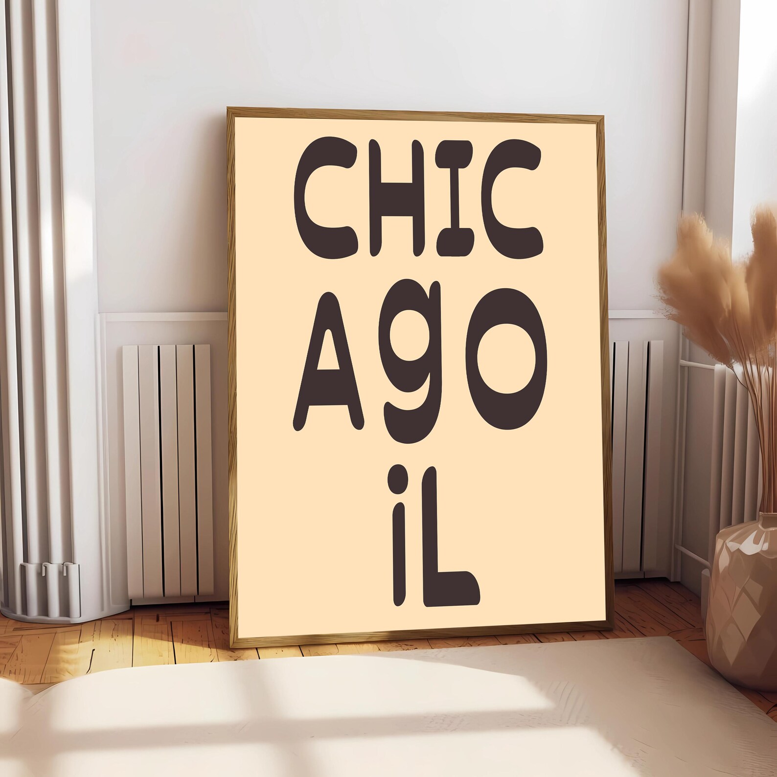
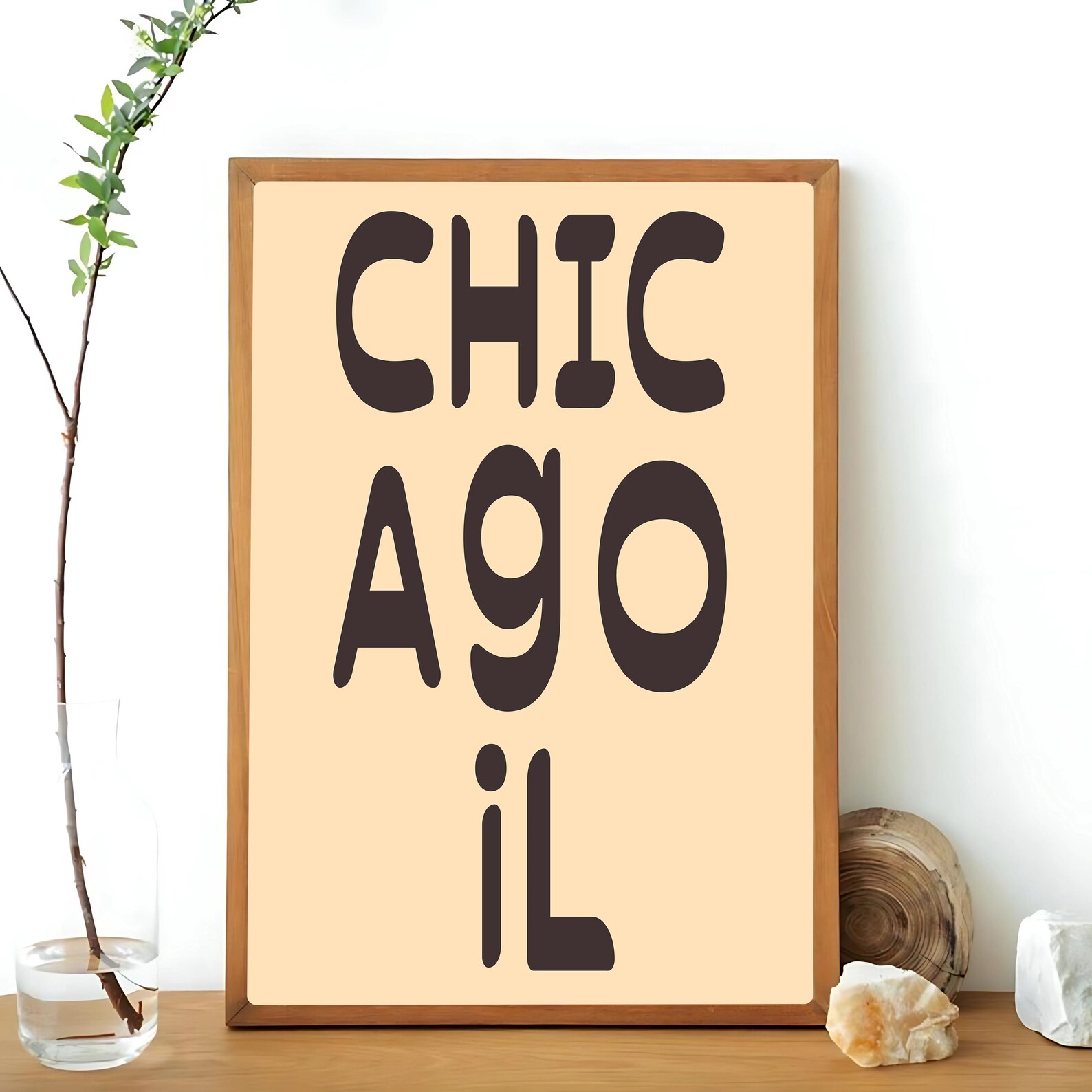
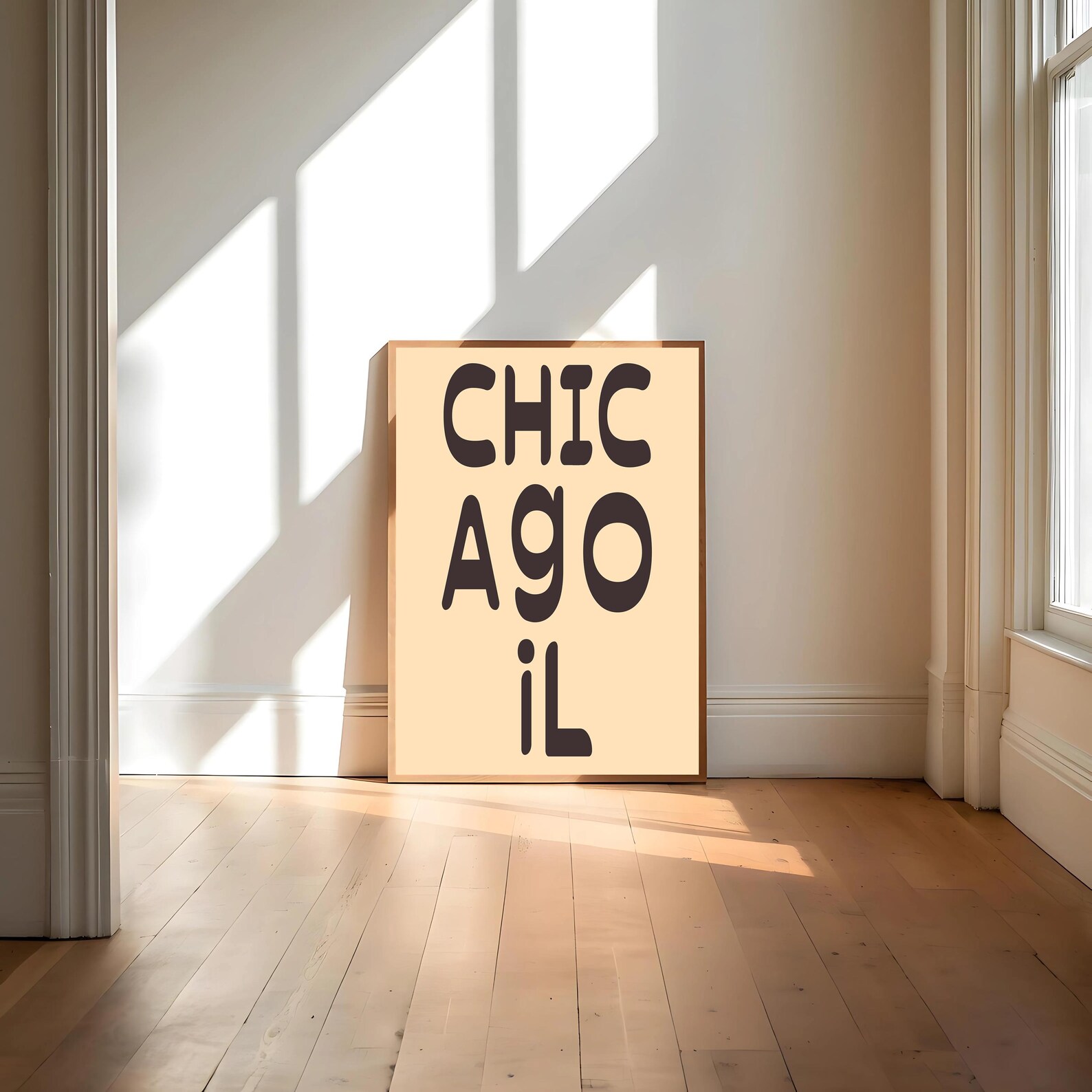
Chicago Vintage Athletic Typography Poster
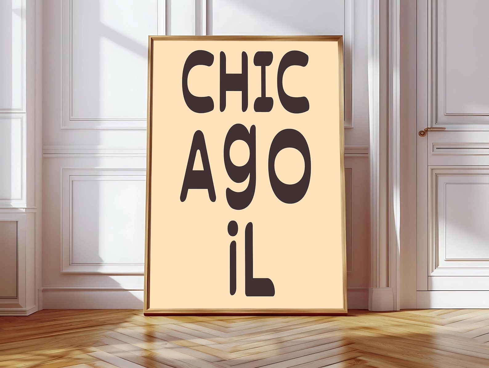
Vintage typography celebrates Chicago with a retro athletic look and a bold city name front and centre.
Description
Chicago takes the lead in a vintage athletic typography style, giving the city name a retro sports feel with clean, graphic energy. The design leans into classic poster language rather than ornament, so the focus stays on the place itself.
A den, hallway, home office, or game room can all carry this look, especially with mid-century, industrial, or sports-inspired decor. Simple framing keeps the typography sharp and lets the vintage character do the work on the wall.
City residents, Chicago fans, and sports lovers will appreciate a print that feels tied to local pride and old-school team spirit. It also makes a thoughtful housewarming or birthday present for anyone who collects place-based wall art.
Materials & Sizes
Premium Matte Paper
- Finish: Matte, smooth, non-reflective.
- Weight: 200 gsm (80 lb), 0.26 mm thick.
- Paper: FSC-certified or equivalent.

Canvas
- Material: Cotton-polyester blend (300–350 gsm) on FSC-certified wood stretcher bars.
- Depth: Slim (2 cm) or thick (4 cm).
- Hanging kit: Included (varies by country).

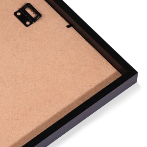
Wooden Framed Poster
- Frame: Pine wood in black, white, natural or dark brown; 20–25 mm deep, 10–14 mm wide.
- Paper: 170 gsm (65 lb) semi-gloss, FSC-certified or equivalent.
- Front: Shatterproof plexiglass.
- Ready to hang: Hanging kit included.
 Every format comes in 5 sizes (inches for the US and Canada, centimeters elsewhere),printed on demand with no minimum order.