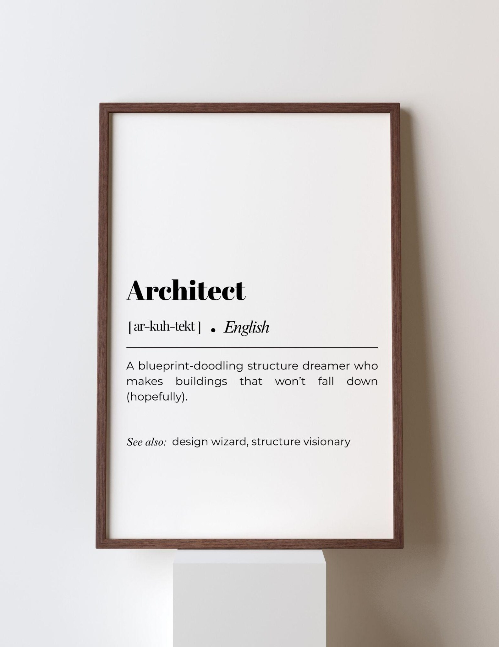
Architect Definition – Funny Typography Art Print
A humorous definition print for architects, written in clean typography and ready to raise a smile.
Description
Architect Definition brings a playful, word-first look to the wall, using clean typography and a funny dictionary-style layout. The humour is straightforward and smart, making the print feel light, modern, and easy to read at a glance.
Home offices, studios, and hallways are natural places for this kind of typography art, especially when the decor leans minimal, contemporary, or professional. A simple frame keeps the focus on the words and helps the print feel polished.
Architects, architecture students, and design-minded friends will appreciate the joke and the subject. It is a thoughtful choice for birthdays, graduations, new job celebrations, or anyone who enjoys witty prints with a clever professional edge.
Materials & Sizes
Premium Matte Paper
- Finish: Matte, smooth, non-reflective.
- Weight: 200 gsm (80 lb), 0.26 mm thick.
- Paper: FSC-certified or equivalent.

Canvas
- Material: Cotton-polyester blend (300–350 gsm) on FSC-certified wood stretcher bars.
- Depth: Slim (2 cm) or thick (4 cm).
- Hanging kit: Included (varies by country).

Wooden Framed Poster
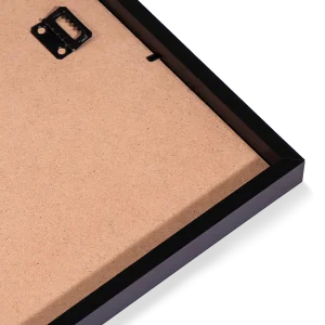
- Frame: Pine wood in black, white, natural or dark brown; 20–25 mm deep, 10–14 mm wide.
- Paper: 170 gsm (65 lb) semi-gloss, FSC-certified or equivalent.
- Front: Shatterproof plexiglass.
- Ready to hang: Hanging kit included.
 Every format comes in 5 sizes (inches for the US and Canada, centimeters elsewhere),printed on demand with no minimum order.