What Goes Best Wit A Cup Of Coffee, Typography
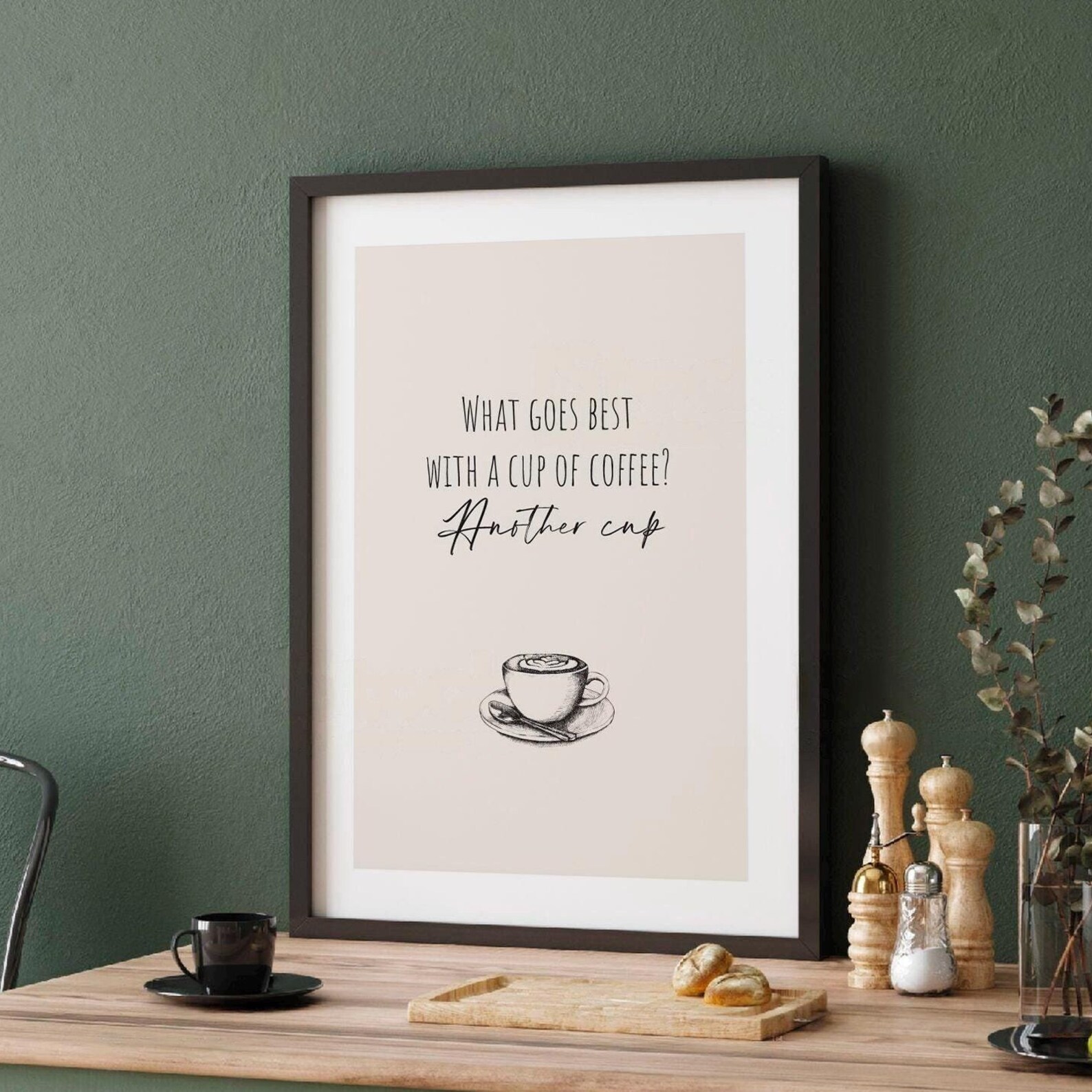
A playful typography print asking what goes best with a cup of coffee.
Description
Bold typography turns a simple coffee question into the subject of the design, with a playful, conversational feel. The wording is the focal point, giving the print a clean, graphic look that suits casual kitchen decor.
The kitchen is an easy home for this kind of wall art, especially above a breakfast nook, coffee station, or open shelf. Keep the frame simple in black, white, or natural wood so the lettering stays front and centre.
Coffee lovers, home baristas, and fans of witty food and drink decor will appreciate the easy humour here. It also makes a thoughtful housewarming present for someone who starts every day with a cup and a smile.
Materials & Sizes
Premium Matte Paper
- Finish: Matte, smooth, non-reflective.
- Weight: 200 gsm (80 lb), 0.26 mm thick.
- Paper: FSC-certified or equivalent.

Canvas
- Material: Cotton-polyester blend (300–350 gsm) on FSC-certified wood stretcher bars.
- Depth: Slim (2 cm) or thick (4 cm).
- Hanging kit: Included (varies by country).

Wooden Framed Poster
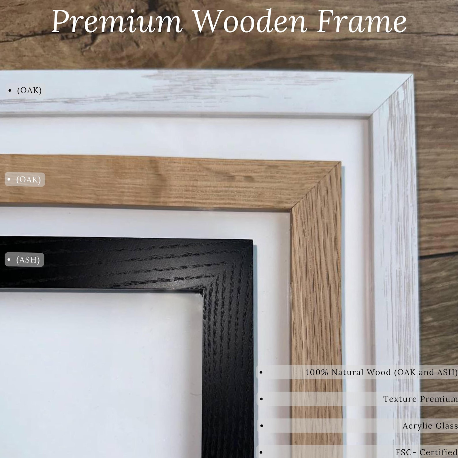
- Frame: Pine wood in black, white, natural or dark brown; 20–25 mm deep, 10–14 mm wide.
- Paper: 170 gsm (65 lb) semi-gloss, FSC-certified or equivalent.
- Front: Shatterproof plexiglass.
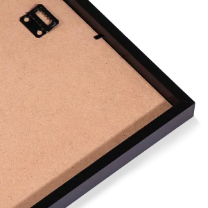
- Ready to hang: Hanging kit included.
 Every format comes in 5 sizes (inches for the US and Canada, centimeters elsewhere),printed on demand with no minimum order.