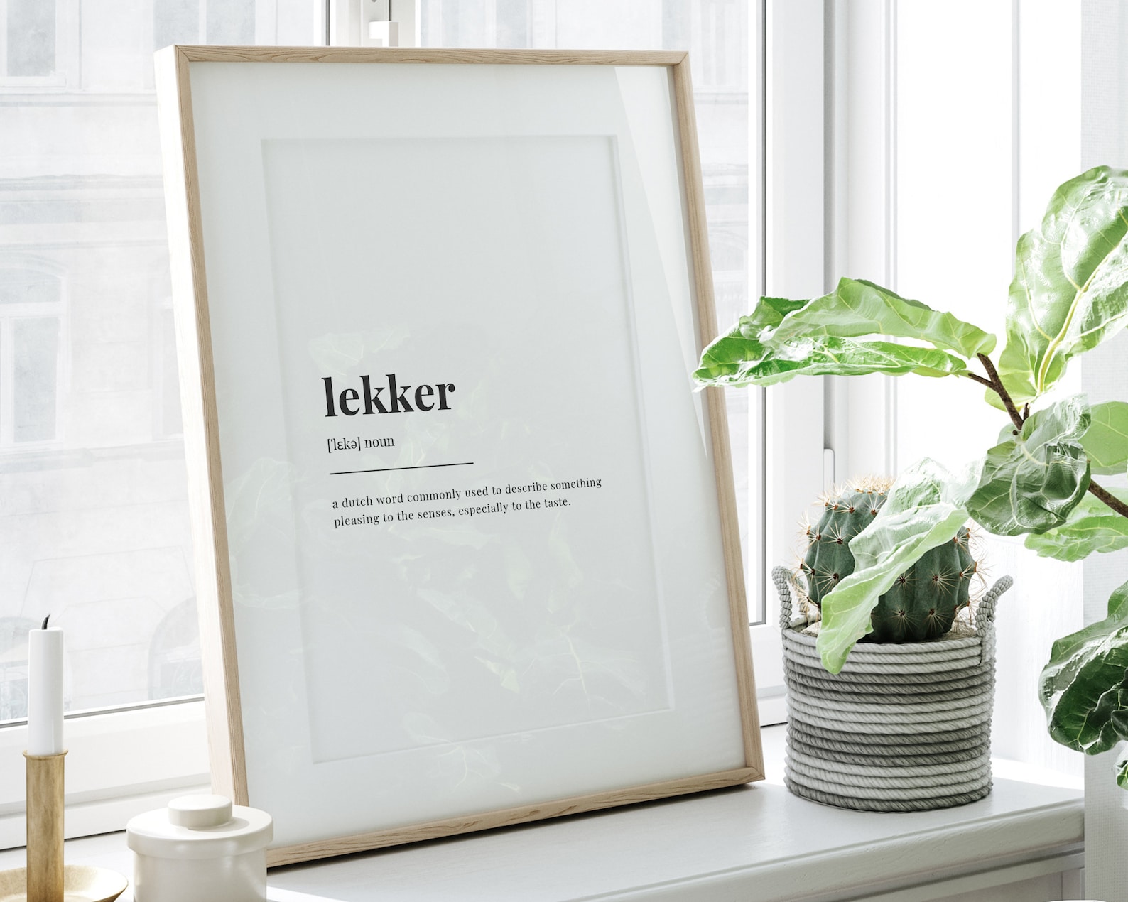
Lekker Definition Meaning Typography Quote
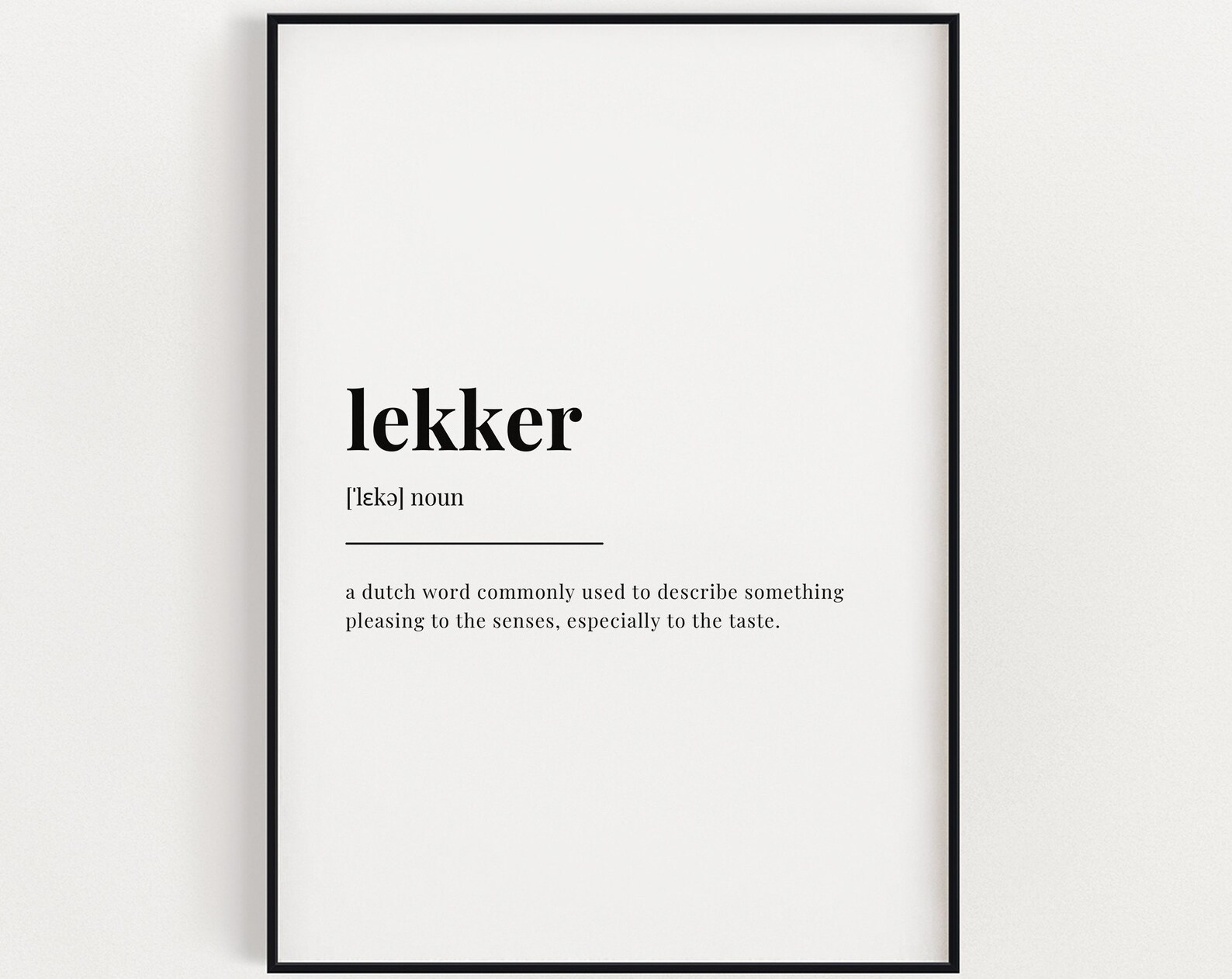
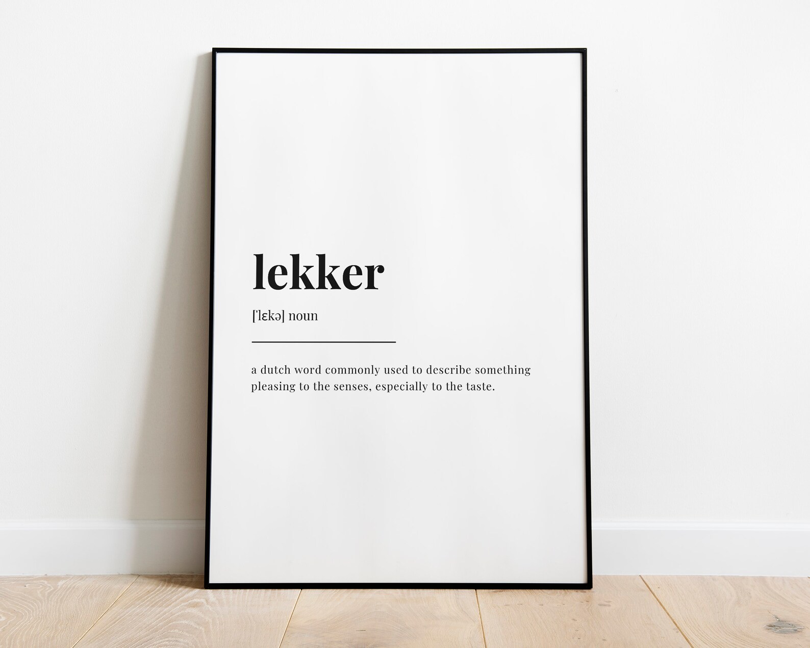
A clean typography print explaining “lekker” as a meaning-rich word with a playful, modern feel.
Description
“Lekker” takes centre stage in a simple definition-style layout, giving the word a lively, conversational feel. The typography-led design keeps the focus on the meaning and the charm of the term itself, with a playful mood that works well in humour-led interiors.
A study, kitchen, hallway, or office wall can all suit this kind of clean quote print, especially when paired with neutral frames and minimal decor. Its straightforward style also sits nicely in modern, Scandinavian, or eclectic spaces that like a bit of wit on the wall.
Buyers who enjoy language, slang, and typography art will appreciate the sharp, readable design. It is also a thoughtful housewarming or birthday choice for someone who uses or loves the word “lekker” in everyday conversation.
Materials & Sizes
Premium Matte Paper
- Finish: Matte, smooth, non-reflective.
- Weight: 200 gsm (80 lb), 0.26 mm thick.
- Paper: FSC-certified or equivalent.

Canvas
- Material: Cotton-polyester blend (300–350 gsm) on FSC-certified wood stretcher bars.
- Depth: Slim (2 cm) or thick (4 cm).
- Hanging kit: Included (varies by country).

Wooden Framed Poster
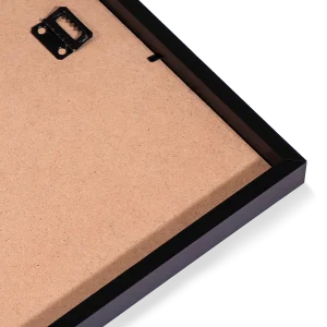
- Frame: Pine wood in black, white, natural or dark brown; 20–25 mm deep, 10–14 mm wide.
- Paper: 170 gsm (65 lb) semi-gloss, FSC-certified or equivalent.
- Front: Shatterproof plexiglass.
- Ready to hang: Hanging kit included.
 Every format comes in 5 sizes (inches for the US and Canada, centimeters elsewhere),printed on demand with no minimum order.